Contributed by Vinci Rufus on May 1 2012
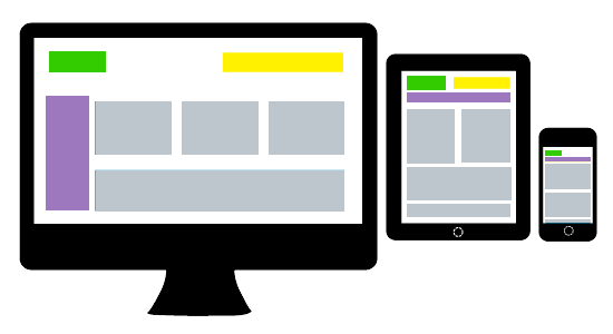
A Website or User Interface is said to be responsive when it is able to change its layout depending on what device it is being viewed on. The logical approach is to first identify the device or screen width and based on that re position or even remove certain blocks of content...
© 2016 Neevtech Blog | Neev Technologies


